UX Is In The Small Things
Earlier this week I got to help host a group of girls visiting Google. They are middle school students in an after-school program focused on engineering, mathematics, and science. My role during the day was to lead computational thinking activities from CS Unplugged. Based on advice from co-workers the group completed the Error Detection and Sorting Networks activities. It was during the sorting networks activity that the kids taught me how vital even subtle parts of UI could be.
The sorting networks activity is designed to teach the concept of parallelization. The students learn that we can sort a set of numbers quicker if we make several comparisons at once. To help the kids out the leader draws out a network or map the kids follow to do the sort. Here’s a video from CS Unplugged demonstrating this activity.
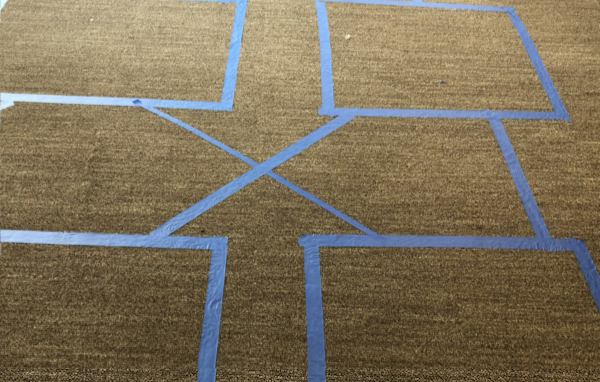
The curriculum provides a worksheet of the sorting network. On the worksheet designed for very young kids, there are two different thicknesses of lines emerging from each box so that kids only have to remember that the bigger number follows the bigger line. When we laid out the sorting network we had two thicknesses of painters tape so we did the same. The path for the larger number was made with tape that was three times as wide as the rest of the grid. Here’s a picture of a small part of the network that shows the two different tapes.

I learned my lesson in UX when the students started walking through the network. We never mentioned the different widths of tape to the students. Instead, we just said, “bigger number to the right” or “bigger number to the left” depending on which version of the sort we were doing (ascending versus descending). When the larger number followed the thicker tape, the students were always successful and moved through the network quickly. When the smaller number followed, the thicker tape, the students got stuck and had to start over. I was teaching, and I was shocked. I had made the widths different simply because I could. I didn’t expect something like that to matter with a group of early teens, but it did. The students likely weren’t consciously aware that there was any logic to the different thicknesses of tape, yet it seemed to help. It was just another piece of evidence that the little stuff matters.
How do we apply this to our lives as developers? We focus on even the small things in usability, both in our products and in our code. Variable names that are descriptive with a consistent style make it easier to read and understand the code. We ensure that the functions we write have sensible defaults and simple, descriptive error messages. When we build APIs, we reduce the mental load on API consumers with fewer variables, clear naming, and predictable behavior.
One of my focuses at work during the last year has been on the usability of GCP’s Ruby libraries. My co-workers are likely sick of hearing me say “idiomatic.” When I interview folks for Developer Relations, I emphasize that idiomaticity is more important than efficiency. In the abstract people get it. Then we’re reviewing their API, and I ask if we really need that sixth parameter and they push back, after all, one more parameter doesn’t add that much more cognitive overhead. In the past I’ve agreed, one more parameter isn’t that bad. Hopefully, now I’ll remember the lesson I learned from the tape and the sorting network; sometimes the little stuff helps even though it seems trivial.